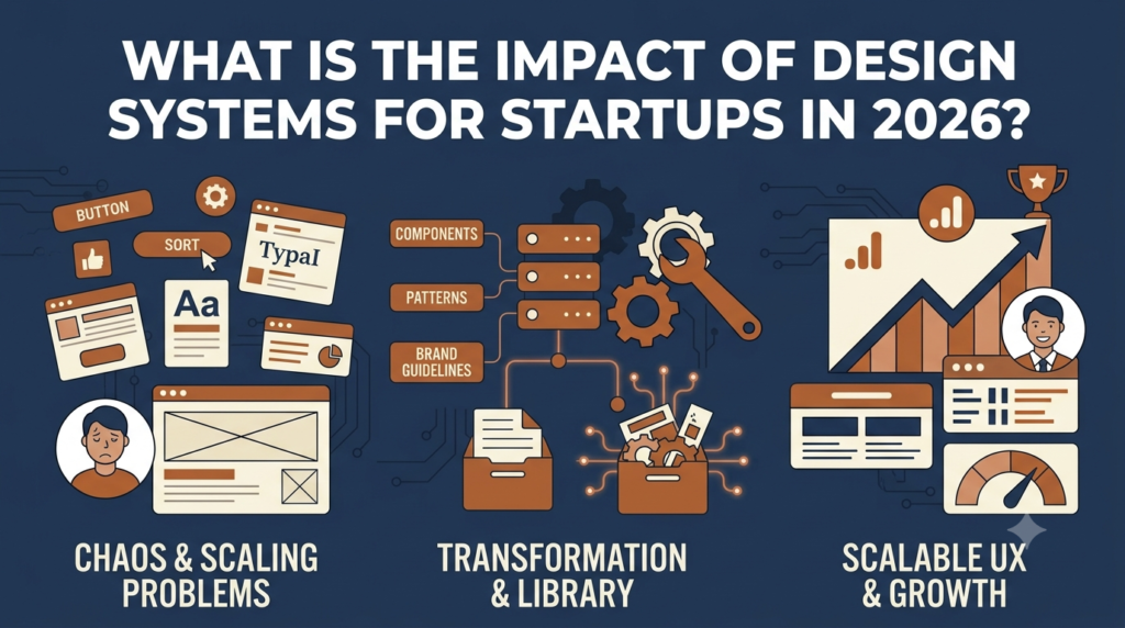
Design systems used to be the domain of large enterprises. In 2026, startups need them too. The volume of digital touchpoints (website, ads, app, email, social, sales decks, support content) means inconsistent design erodes brand recognition before it can build. A modest design system implemented early saves significant rework later.
This guide covers the practical approach to building design systems for startups: what to include, what to skip, and the workflows that keep the system useful as the team grows.

What a design system actually is
A structured library of design decisions, documented and reusable. The components: Design tokens are the smallest reusable values (colours, font sizes, spacing scales, border radii, shadows). Components are reusable interface elements (buttons, form fields, cards, navigation patterns) with multiple states and variants. Patterns are common combinations (page headers, hero sections, modal dialogs). Guidelines document when and how to use each element.
For startups, the order of investment matters. Start with tokens. Then components. Then patterns. Detailed guidelines come last.
Design tokens for startups
The token set worth defining early: Colour palette of 6 to 12 named colours covering primary brand, accent, neutrals, success, warning, error, each with at least 5 shades. Typography scale: 1 to 2 typefaces maximum, 6 to 10 size variants. Spacing scale: powers of 2 or 4 (4, 8, 16, 24, 32, 48, 64). Border radii: 3 to 5 values. Shadows: 3 to 5 elevation levels.
These tokens fit in a 1-page Figma file plus a corresponding JSON or CSS variable file. Total investment: 3 to 5 days for an experienced designer.
Component library
The minimum viable library: Buttons (primary, secondary, tertiary, with sizes and states). Form fields (text input, textarea, select, checkbox, radio, toggle). Cards (container component used everywhere). Navigation (header, footer, sidebar if applicable, mobile menu). Modals and overlays. Typography components (page title, section header, body text, small text).
Total component count: 20 to 30 components in the minimum viable system. Build over 2 to 4 weeks of designer time.

Tooling choices
Figma is the standard source of truth. Set up: one Figma file for foundation tokens (published as a Library), one Figma file for components (built using foundation tokens). Design files for each product (web, app, marketing site) import from the libraries. Updates propagate automatically.
Code side: tokens exported to CSS custom properties or design token formats. Tools like Style Dictionary or Figma Variables generate code from Figma tokens. Component library in code depends on stack: React with Storybook plus Tailwind, Chakra UI, Mantine, or custom; Webflow with Symbols; Shopify themes with section blocks.
What to skip early
Comprehensive iconography (use Phosphor, Lucide or Tabler initially). Illustration system (stock or simple SVG until volume justifies custom). Motion guidelines. Detailed accessibility documentation (follow WCAG AA basics but do not over-document). Marketing-specific patterns (often diverge from product, keep separate).
Maintaining as the team grows
The biggest design system failure mode is abandonment. The team grows, design needs grow, the system gets ignored. Prevention: Assign owners (one designer owns the system). Update process (new components proposed in brief docs, reviewed weekly). Audit quarterly. Versioning for major updates.
When to expand
Triggers that justify expansion: Multiple designers producing inconsistent output. Product growth into new surfaces. Brand refresh or repositioning. Engineering complaints about implementation friction.
What to expect
For a startup at 10 to 30 people with a basic design system: initial build 4 to 8 weeks of focused design time. Ongoing maintenance: 10 to 20 percent of design team capacity. Impact: design velocity 30 to 50 percent faster after system in place. New designers ramp in 1 to 2 weeks instead of 1 to 2 months. The design system is rarely the most exciting work but compounds value over years. Skipping it produces visible costs (inconsistency, slow design, frustrated engineering) that always exceed the cost of building it.